
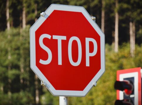
Why Stop Signs Are Octagonal: The Design History Revealed
By Trivia Daily, Staff Writer — Published July 24, 2026
Table of Contents
- Key Takeaways
- The Birth of Stop Signs Octagonal Design in Early America
- Why Eight Sides Instead of Six or Ten?
- The Evolution from Yellow to Red
- International Adoption and Standardization
- Modern Manufacturing and Reflectivity Standards
- Frequently Asked Questions
Every driver recognizes the distinctive eight-sided red sign that commands vehicles to halt at intersections worldwide. But have you ever wondered why stop signs are octagonal rather than circular, square, or triangular? This curious design choice wasn’t arbitrary—it emerged from a fascinating blend of engineering necessity, practical psychology, and standardization efforts that transformed road safety. The answer reveals surprising facts about how shape itself communicates urgency even before a driver can read a single word.
The octagon’s story begins in the early automotive era, when roads were chaotic and traffic control was practically nonexistent. Today’s uniform stop sign represents decades of experimentation, debate, and refinement that continue to save lives at every intersection.
Key Takeaways
- Stop signs became octagonal in 1915 in the United States to create instant recognition through shape alone, allowing drivers to identify the sign even from the back or when covered in snow.
- The octagon was chosen specifically because it has more sides than any other common road sign, making it the most distinctive shape for the road’s most critical command.
- Early stop signs were actually yellow with black lettering until 1954, when improved fade-resistant red paint made the current color scheme practical.
- The shape standardization spread internationally, with the Vienna Convention on Road Signs and Signals officially recommending the octagonal stop sign for global use in 1968.
- Modern stop signs measure 30 inches across in the United States, though larger 36-inch versions are required on roads with speed limits above 45 mph.
- The octagon’s unique geometry allows drivers to recognize a stop sign from any angle, including from behind, which proves critical at poorly lit rural intersections.
The Birth of Stop Signs Octagonal Design in Early America
When automobiles first shared roads with horses and pedestrians in the early 1900s, traffic control was haphazard at best. Different cities invented their own signage systems, creating confusion for anyone traveling between municipalities. Detroit installed the first stop signs in 1915, and these pioneering markers were indeed octagonal—a shape deliberately chosen to stand apart from every other warning on the road.
The octagon solved a critical problem: instant recognition. Traffic engineers understood that drivers needed to identify stop signs in a split second, often while traveling at speed or in poor weather conditions. A circle might be confused with railroad crossings. Squares and rectangles already dominated informational signage. Triangles typically warned of hazards. The eight-sided polygon remained unused, making it perfect for the road’s most unambiguous command.
Interestingly, these original stop signs bore little resemblance to today’s versions beyond their shape. They measured smaller, featured yellow backgrounds with black text, and lacked the reflective materials we now take for granted. The yellow coloring wasn’t a design preference—it was a practical limitation of available fade-resistant paint technology at the time.
Why Eight Sides Instead of Six or Ten?
The specific choice of eight sides rather than six, ten, or twelve involves both practical and psychological considerations. An octagon provides enough sides to appear distinctly different from common geometric shapes while remaining simple enough to manufacture consistently. Six sides might too closely resemble a circle from a distance, while more than eight sides would increase production complexity without adding recognition value.
The octagon also offers superior visibility from oblique angles. Unlike a circle, which appears identical from any direction, or a square, which can look like a diamond when rotated, an octagon maintains its distinctive silhouette whether viewed straight-on or from the side. This geometric property proves essential at complex intersections where drivers approach from multiple directions simultaneously.
Shape recognition operates faster than word reading in human visual processing. Your brain identifies the octagonal outline before consciously registering the letters S-T-O-P, providing a crucial fraction-of-a-second advantage in reaction time. This neurological reality makes the shape itself a safety feature independent of language, benefiting everyone from new drivers to international travelers.
The Evolution from Yellow to Red
The transformation to red octagonal stop signs occurred in 1954, marking a significant milestone in traffic control history. For nearly four decades, stop signs had remained yellow because red paint faded rapidly when exposed to weather and sunlight. The development of durable, fade-resistant red enamel finally made the more psychologically appropriate color viable for outdoor use.
Red carries universal associations with danger, urgency, and the need to stop—connections that transcend cultural boundaries. The color change improved compliance rates and reduced intersection accidents, validating the decades-long wait for suitable materials. The transition wasn’t instantaneous; some yellow stop signs remained in service well into the 1960s as municipalities gradually replaced aging signage.
International Adoption and Standardization
While the octagonal stop sign originated in North America, its effectiveness led to international adoption. The Vienna Convention on Road Signs and Signals, established in 1968, recommended the octagonal red stop sign as a global standard. Today, the design appears across six continents, from bustling Tokyo intersections to remote Australian outback crossroads.
Some regional variations exist. Certain countries add their language’s equivalent of “STOP” or use multilingual text, while others maintain the English word even in non-English-speaking nations. The shape, however, remains remarkably consistent worldwide—a testament to its functional superiority.
| Region | Stop Sign Text | Adoption Period |
|---|---|---|
| United States | STOP | 1915 (octagon), 1954 (red) |
| Canada | STOP / ARRÊT | 1920s |
| United Kingdom | STOP | 1960s |
| Japan | 止まれ (Tomare) | 1963 |
| Spain | STOP | 1960s |
Modern Manufacturing and Reflectivity Standards
Contemporary stop signs incorporate sophisticated materials that early traffic engineers couldn’t have imagined. Retroreflective sheeting—composed of tiny glass beads or prismatic elements—bounces vehicle headlight beams directly back to drivers, making signs visible in complete darkness. This technology has dramatically reduced nighttime intersection accidents since its widespread adoption in the 1960s and 1970s.
The Manual on Uniform Traffic Control Devices, which governs road signage in the United States, specifies exact requirements for stop sign dimensions, colors, and reflectivity. Signs must maintain visibility from at least 500 feet under normal conditions, with reflective coatings meeting strict brightness standards measured in candelas per lux per square meter. These technical specifications ensure consistent performance whether you’re driving through Minnesota winters or Arizona summers.
Frequently Asked Questions
Why don’t all countries use the same word on stop signs?
While the octagonal shape is internationally standardized, the text varies by language and regional preference. Many non-English-speaking countries retain “STOP” because it has become a recognized international symbol, while others use their native language to ensure immediate comprehension by local drivers.
What happens if a stop sign gets damaged or turned around?
The octagonal shape allows drivers to recognize a stop sign even from behind or when text is obscured, though municipalities typically replace damaged signs quickly. The distinctive eight-sided silhouette remains identifiable even when covered in snow, graffiti, or viewed in a mirror.
Are there different sizes of stop signs for different roads?
Yes. Standard stop signs measure 30 inches across, but high-speed roads require 36-inch versions for earlier visibility. Oversized 48-inch stop signs exist for expressway off-ramps and other special applications where extended sight distance is critical.
When were reflective stop signs first required?
Reflective materials became standard for new stop signs in most U.S. states during the 1970s, though some jurisdictions adopted them earlier. Today, all stop signs in developed nations must meet minimum retroreflectivity standards to ensure nighttime visibility.
The humble stop sign represents a triumph of human-centered design—a shape so perfectly matched to its purpose that it has remained essentially unchanged for over a century. Next time you brake at an intersection, consider how that simple octagon communicates across languages, weather conditions, and even the limits of human vision, performing its life-saving duty billions of times each day around the world.